Website/UX/UI
LEAP:
Latino/a Educational
Achievement Project
LEAP needed a landing page for 2018 Conference. I created a new landing page design where users and attendees could find information about the event.
THE BUSINESS
The Latino/a Educational Achievement Project, or LEAP, works with community leaders in the movement for justice and equity through civic engagement programming, increased educational opportunities, advocacy, and community initiatives.
THE PROBLEM
The annual LEAP conference attracts hundreds of participants from across the state to take part in two days of civic engagement workshops, community empowerment, and advocacy in practice, LEAP wanted to increase awareness of millennials and increase the number of registrants for this event.
MY CONTRIBUITION
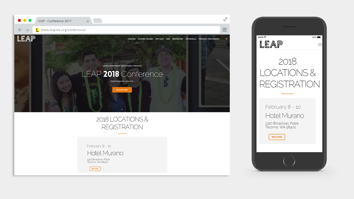
I worked on a layout and design that was visually appealing and adaptive to mobile.
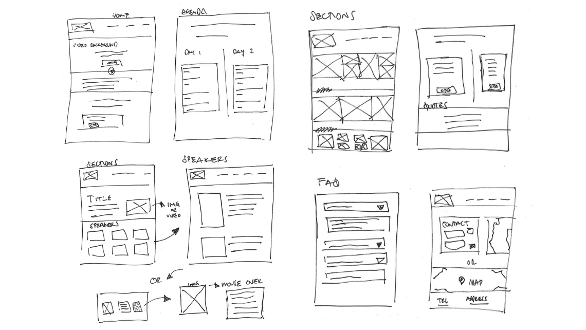
I coordinated facets of design including: user task flow, interaction, wireframe, visual and prototyping.
I worked with stakeholders providing wireframes and prototypes to explain design decisions and tactics.
STRATEGY
The design and final prototype were built upon the results of discovery main areas:
1. It had it to be eye catching
2. Simple and easy way for user to register
3. Show students testimonials from previous years
Talking to stakeholders identified the following design objectives:
• Increase the number of registrants
• Ensure design and functionality incorporate mobile compatibility to enrich user experience
• Show pictures and videos for a better understanding of the event
• Increase awareness
The website look and navigation incorporated this feedback:
• Heroe video - A large video background grabs the attention and shows the registrant what to expect the day of the event.
• Call to Action - A CTA button that takes the user to the main goal (register to the event).
• Schedule - The landing page shows the schedule so that registrants know what to expect after registering.
• Speakers - The speakers and their bios are shown on the page to add credibility to the events. This provide confidence knowing they’re learning from professionals.
• Responsive design - Visitors have a consistent experience regardless of how they access the site. With responsive design, visitors are free to access the website with their desktop or mobile device of choice.

OUTCOME
The new website was well received by users. Information layout and images attract attention and lead visitors down the page. The space was well used and directs the eyes towards area of interest for the visitor. The number of the registrants increased in 2018 by 83% comparate with the 2017 conference.


