UX Design
SHUNPIKE
Shunpike needed redesign their website. The main problems were that users couldn’t apply for services, make donations to artists and to the organization.
THE BUSINESS
Shunpike is a Seattle based organization founded in 2001 that provides fiscal sponsorship to arts groups in Washington State with various programs, services, resources and opportunities they need to forge their own paths to sustainable success.
Shunpike serves almost 200 arts groups throughout Washington. Collectively, this cohort collaborates with 5,000 artists annually to create 2,500 artistic projects, seen by 500,000 people.
GOALS
The primary goal was to create a responsive website that effectively and beautifully unites the various programs, informs potential and current fiscally sponsored groups, and engages their partners and supporters. I worked with a team of 8 colleagues identifying key flows and created a new design which includes a new visual look, a more clear enrollment process, page hierarchy, navigation, individualized artist profiles and a style guide.
DESIGN PROCESS
Research
Meeting with Shunpike Board
Competitive & Heuristic Analysis
Ideate
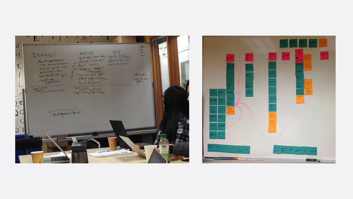
Global Navigation
User Journeys
Sketches, Wireframes & Prototyping
Design
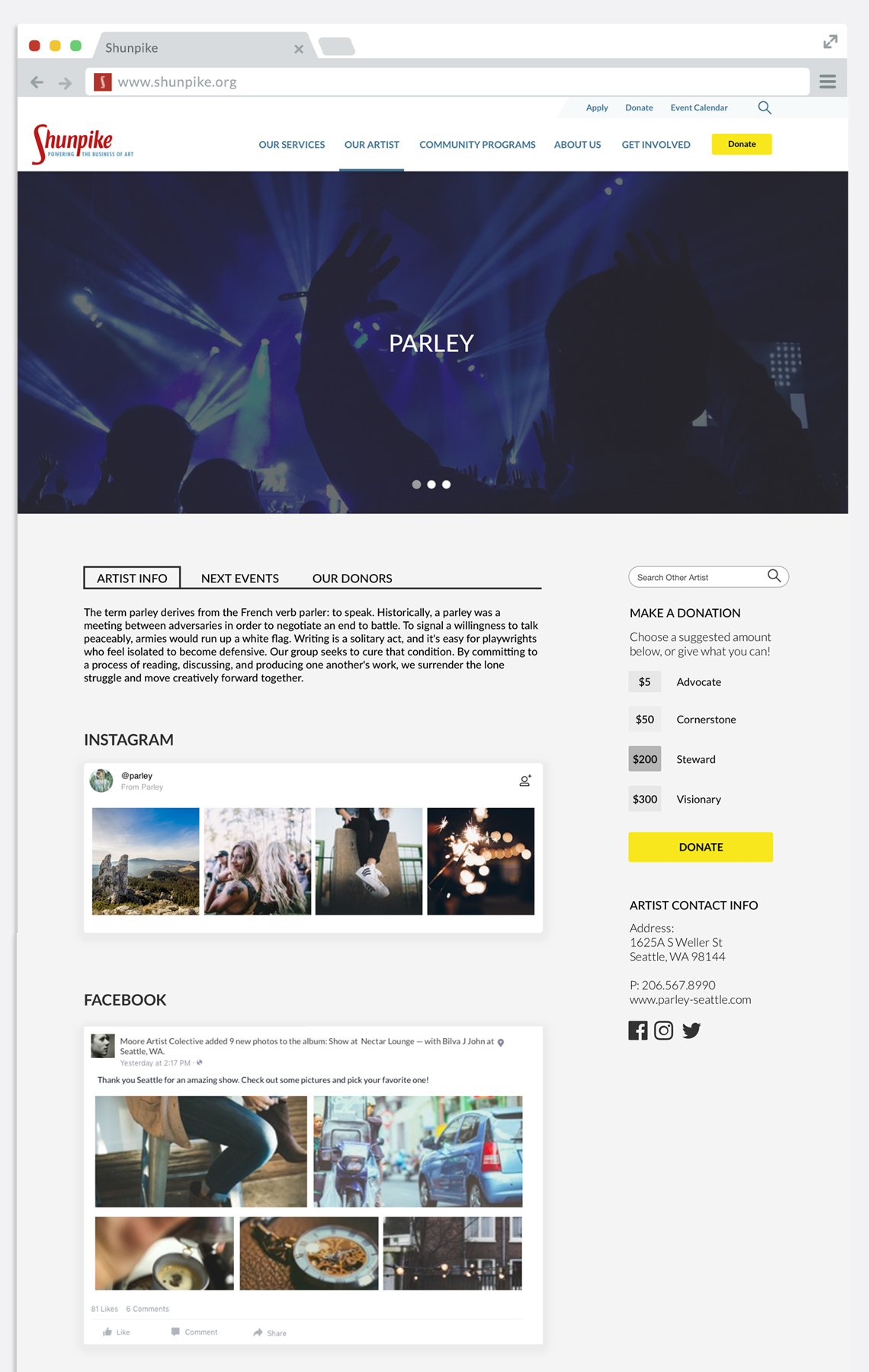
Artist Page
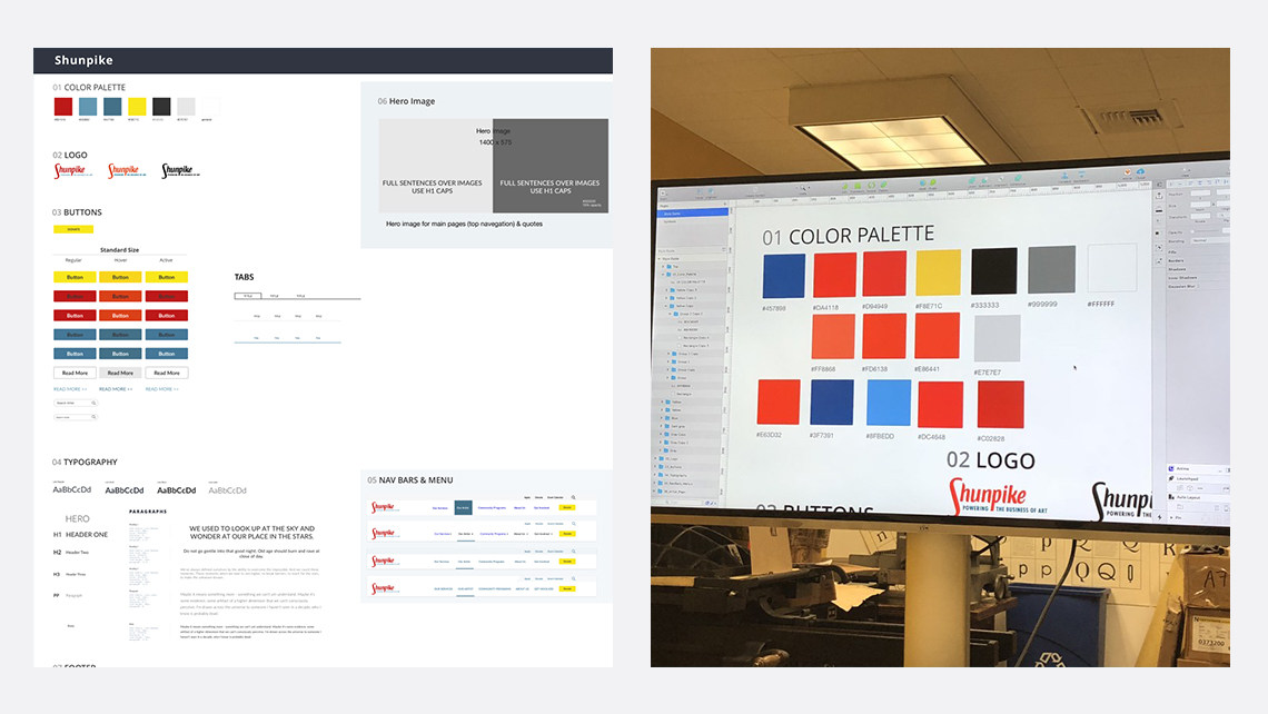
Style Guide
Handoff
Final Presentation & Development
KEY FINDINGS
There were 2 main areas where users were getting frustrated. One was the artist sign-up page. Artist only could sign up during a brief enrollment periods and the information provided on website was unclear. The other was that the donors couldn’t find a list of artist or they couldn't search for one. Donors had confusing about how to donate money to an specific artist/band or how to donate to Shupikes organization.

MY CONTRIBUTION
My main focus was to work on the user flow, in a new design for the Artist page so that information was more understandable for users and create the style guide.
In the redesign of the Artist page, my end goal was to provide users with high-level understanding of subscribed artists/bands, and compel them to dig deeper and ultimately donate money and support the artist.
I designed the page with a hero slider image, broke information with tabs and used modular design and have clean and simple. Visuals, text and social feed keep the user engaged.
I broke out information into more digestible components and used a modular design to provide more space for content to breathe. Visuals and text were alternated to keep the user engaged. I employed infographics and statistics to give the user a tangible idea of Shunpike’s impact on the arts community and its artists from a fiscal perspective. This was used to appeal to a users with multiple needs and desires.
After a colleague created the typography style, I created the style guide with colors, buttons, tabs and type styles. These were created to ensure we came out with one cohesive site design.

PROCESS
This project was completed over the course of nine weeks, the first 7 were spent researching, concepting, and fully developing the user flow, experience, and interface of new website.
The last three weeks were devoted to iterate and creating the final prototype.

OUTCOME
The final prototype was was well received by stakeholders. Information layout and images attract attention to users and staff members. The space was well used, the architecture, images and call to actions buttons directs the eyes towards area of interest for the visitor.

