Sea Mar Museum
The Design Brief
After talking to key staholders and VP's in the organization I had most of the information that I needed to start on the logo design. There were a few other emails and conversations clarifying things but basically, all the information was there. After reviewing my notes and emails I found in short that they wanted a logo that portrayed the Latino heritage and history, and needed to be: "strong, bold & simple" They also requested to have it black and were open to color choices. VP's also wanted to have an eagle in the logo because of its representation on the Chicano/Latino movement in the 60's and it's also part of the current Sea Mar logo.
Final Design


Research
I started researching what was needed for the project. This included looking up Sea Mar's Museum competitors, researching the industry and searching for other logos in the industry, among other things.
Sketching & Development
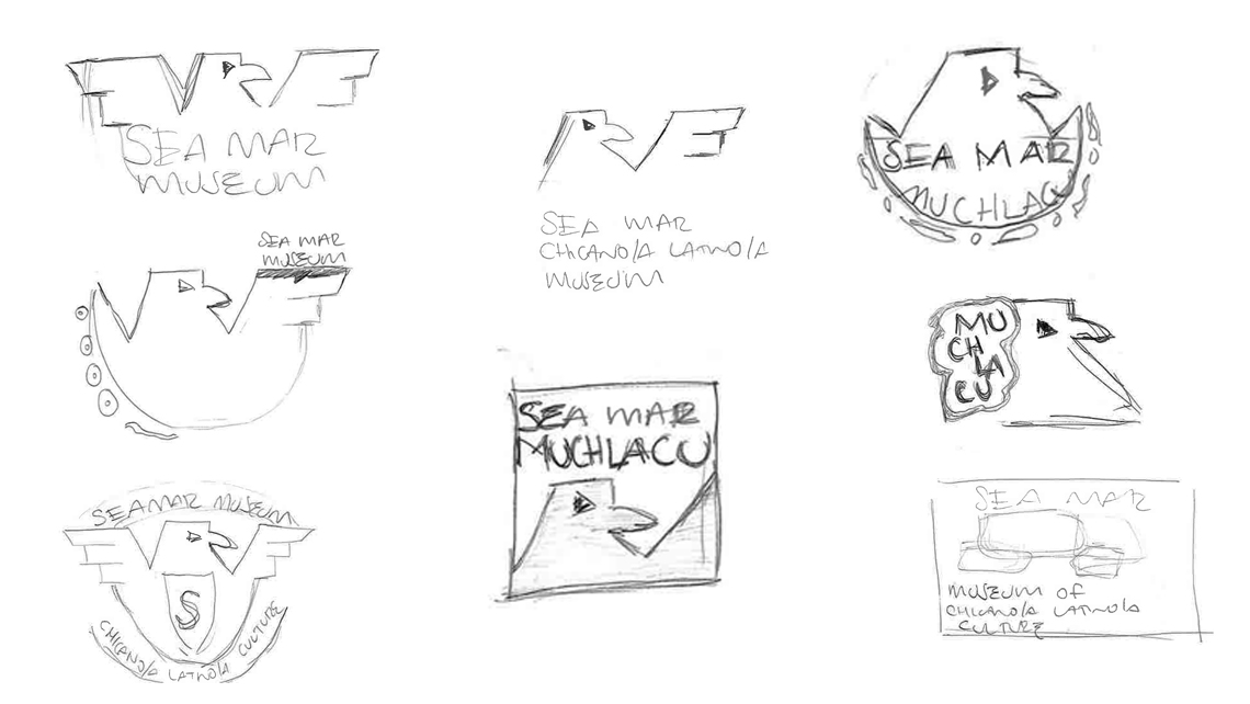
Based on the design brief and research conducted, I brainstormed and sketched down my ideas. The challenge that I had when creating the logo was trying to express and associate past and present. Below you will find original pages of sketches that I did for the Ultimate Potential logo.

Proposals

Final Design
